One color or 4 color printing: how to choose?
Le 24 février 2025

Which file format should I use for optimal marking quality?
Files circulate frequently within a company, being necessary for various departments such as marketing department for product and packaging design, events for decorations and derivative products, or even administrative services for paper letterhead and business cards. Tracing the history of a logo often becomes complex in the absence of a defined charter.
To print, screen print, engrave, transfer or embroider a file on a product, it is crucial that its quality is optimal. It is therefore essential that the files stored in the company's computer system are source files such as an AI (Illustrator) file or an EPS file, or even a vectorized high-definition PDF.
Vectorizing an image makes it possible to adapt the visual to the branding machine. For example, for embroidery, specific software is used to insert the file and adapt it to the embroidery process. This allows you to work on the details of the visual, such as the letters, so that they maintain their rounded shape even if the thread is embroidered straight. On the other hand, formats such as PNG, JPEG, HEIC, HEX, RGB, or screenshots are not suitable for these processes.
What is the difference between four-color marking and pantone marking?
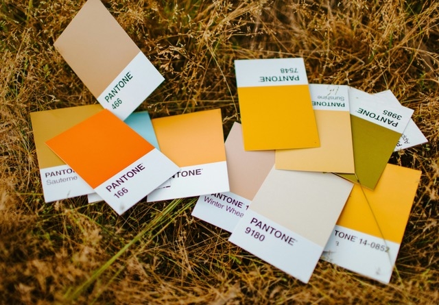
Imagine yourself facing 15 cans of paint, all different shades of brown. Each pot is identified by a unique number, corresponding to a specific shade. These international numbers make it possible to obtain the same color throughout the world. These are Pantones, predefined colors delivered in paint cans. You can easily find them on the internet by searching for their number, for example "Pantone 410C" or "Pantone 7519C". So, by using Pantones, the color of a logo always remains the same. These are direct, full shades, without gradients.
Four-color process is a mixture of four primary colors, known as CMYK (Cyan, Magenta, Yellow, Black). We create a film for each color, and the superposition of these films gives the final rendering of the visual (to find out more: : Wikipédia). This process allows you to obtain a multitude of colors and gradients, which is not possible with Pantones.
For example, by adjusting the percentages of blue and yellow, it is possible to go from one green to another. If your visual is in four colors, it is essential to know the percentages of each color to obtain the desired result.
If your color is orange, obtained by four-color process (example: 15% CYAN/56% MAGENTA, 100% YELLOW/3% BLACK), and you wish to print only 1 color for budget reasons, you can find the Pantone equivalents as follows: it's up to you to choose the one that seems most suitable to you.

How do I define the color of my marking?
In the best case, your company's graphic charter provides the company's colors. If your charter is well documented, you should have a document listing all the colors and % CMYK used in your logo as well as the recommended Pantone equivalents, closest to the four-color colors (or vice versa).

If you don't have any document of this type, tools like Photoshop or other visual processing software will allow you to determine the color of your elements. However, it is advisable to contact a specialized agency to produce valid documents for any future support, whether paper, textile or any other material.
Some comments:
• If your logo is gradient, you will necessarily have to go through full-color printing
• If your logo offers several direct colors, without gradient, of a variation of the same shade, (3 different reds for example) it is preferable to know the 3 equivalent pantones if your file is in four color. So depending on the support to be marked, and therefore the technique used, you will save on the price of marking.
• We are of course available to advise you, which is why it is crucial to send us your visuals when inquiring for a quote.